


Color Psychology in Event Design: How Hue Influences Mood and Memory
Leah Allison, Design and Development Manager, Florida
Event planners are part artist, part psychologist, part caffeine-fueled crisis negotiator. And while we can debate whether the coffee budget or the AV bill gives us more palpitations, here’s one truth: nothing changes a room faster—or cheaper—than color. That’s the power of event color psychology in action.
Color doesn’t just decorate an event. It whispers, shouts, calms, excites, and occasionally says, “You’ve had enough dessert, darlin, time to head out.” It can set the tone before the keynote even clears their throat.
If you’ve ever walked into a room awash in cool blues and felt your blood pressure drop, or stepped into a space glowing in golds and felt instantly more important, congratulations, you’ve been played… in the best way possible. That’s color psychology working its magic.
Step One: Ask Yourself “Why” Before “Which”
Before I start waving fabric swatches around like a wedding planner in a rom-com, I go straight to the event’s purpose.
Is the goal to build trust? Spark collaboration? Throw a party that makes the CFO question the budget but not the ROI?
Every color has a personality:
- Blue: Trust, calm, focus. Your “we’re all adults here” color.
- Yellow: Optimism, creativity, energy. Sunshine in linen form.
- Red: Passion, urgency, excitement. Also known as the “please don’t use this for a four-hour training” color.
- Green: Balance, renewal, wellness. Basically a spa day for your eyeballs.
Get the “why” right, and the “which” practically picks itself.
The Green Scene: My Ride-or-Die Hue
If my events were a wardrobe, green would be the little black dress. It’s versatile, flattering, and always in style.
Green feels fresh without trying too hard. Clients love that it screams “sustainability” without having to rent an actual alpaca. I love that it instantly un-stuffs stuffy spaces. Bring in potted palms, hanging greenery, or a lush wall backdrop, and suddenly your windowless ballroom feels less airport conference center and more destination wedding in Tuscany.
When Color Does the Heavy Lifting
One of my proudest “we nailed it” moments? A two-night event series where the only real difference was the palette. You’d swear they were two different worlds.
Night one: Jewel tones with a soft pink uplight. Elegant, calming, and just energizing enough to keep people mingling without breaking into a conga line.
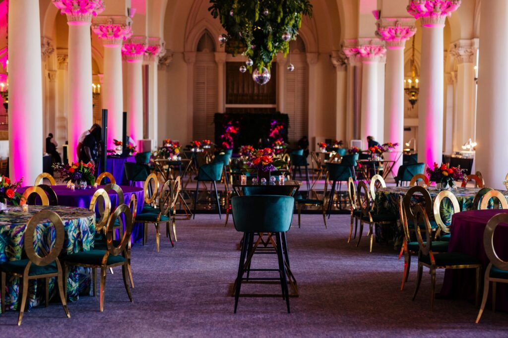
Night two: Pinks and oranges under the stars with cheeky tropical props (yes, coconuts made it into the centerpieces). Loud, lively, and full of “I’m staying until they kick me out” energy.
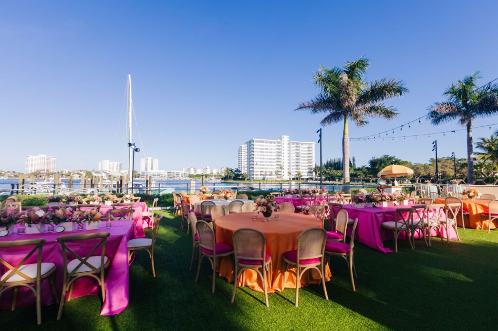
The guest list didn’t change. The space didn’t change. But the colors? Total personality swap—a perfect example of how event color psychology can shift energy and perception.
Blue’s Clues: Designing for Connection
If I want people to actually talk to each other—like real, thoughtful conversation, not “how’s the weather?”—I reach for blue.
Blue is the social lubricant you didn’t have to put on the bar menu. It’s calm without being sleepy, dependable without being boring. Paired with warmer elements (think amber lighting, wood tones), it makes networking feel less like speed dating with name badges and more like an actual connection.
When Brand Colors Need a Mood Adjustment
Sometimes a client’s brand palette is all “rock concert,” but the event calls for “fireside chat.”
Here’s my fix:
- Use the bold color sparingly, like hot sauce.
- Shift the temperature so bright red becomes a muted merlot.
- Surround it with neutrals and textures that soften the vibe.
Example: A bright red brand turned into a networking brunch with taupe seating, blush linens, and tiny hits of red in the napkins, gobos, and welcome signage. The brand was present. The panic wasn’t.
Top Hue-Miliation Moments to Avoid
- Brand color overkill. Just because your logo is orange doesn’t mean your stage, napkins, and server aprons need to match. We’re designing an event, not an orange orchard.
- Skipping sensory layering. Pair color with scent, sound, or texture. A yellow-and-white luncheon with lemon centerpieces? Looks fresh, smells amazing, and says “hello, sunshine” without a single icebreaker.
- Ignoring lighting’s personality disorder. Red at noon is a shout. Red at 8 p.m. is a smolder. Test under real lighting conditions before you commit.
Lights: Color’s Mischievous Partner in Crime
Lighting is the mood manipulator your attendees never see coming.
Bright white on blue? Crisp and energizing. Dimmed amber on the same blue? Warm and cozy.
I work with lighting designers early to avoid the “Oh… that’s not the vibe” moment during setup. It’s shocking how often the problem isn’t the color, it’s the light playing tricks.
Trend Watch: Down to Earth
Earthy tones are having their moment. Terracotta, olive green, and warm clay shades are popping up everywhere from corporate galas to leadership retreats. In our over-scrolled, over-screened lives, these colors feel like taking a deep breath.
Plus, they’re incredibly forgiving in photos, which means your photographer will thank you when they’re editing at 2 a.m.
Color + Emotion Cheat Sheet for Planners
Think of it as your palette personality guide:
- Blue: Trust, calm, focus (collaboration rooms, strategy sessions)
- Green: Balance, renewal, wellness (wellness retreats, sustainable themes)
- Yellow: Optimism, creativity, energy (daytime events, brainstorming)
- Orange: Warmth, enthusiasm, excitement (parties, networking)
- Red: Passion, urgency, excitement (launches, rallies)
- Purple: Creativity, luxury, imagination (VIP lounges, gala dinners)
- White: Openness, clarity (product reveals, minimalist setups)
- Black: Elegance, formality (awards nights, luxe affairs)
Color isn’t just the pretty face of your event, it’s the body language. It can guide arrivals, cue conversations, and make people remember how they felt long after they’ve forgotten the dessert menu.
So, before you pick your palette, ask yourself:
- What do I want people to feel the second they walk in?
- How do I want that energy to shift throughout the event?
- And what memory do I want lingering after they leave?
Because the right hue doesn’t just dress a room, it dresses the mood. Event color psychology turns those hues into strategy—and when you get it right, it’s not just an event. It’s a vibe they’ll remember.
 "/>
"/>
 "/>
"/>
 "/>
"/>